The build
18 pages designed & built by hand, zero templates
The experiences
3 signature moments: a film theater, a poster wall, a print editorial
The fidelity
1:1 Figma to code: the live site matches the mockups to the pixel
/100 Google PageSpeed on mobile · tested
Designed & engineered by Thornwood Digital · live at dylansimpsonfilms.com
Award-winning films deserved better than a template.
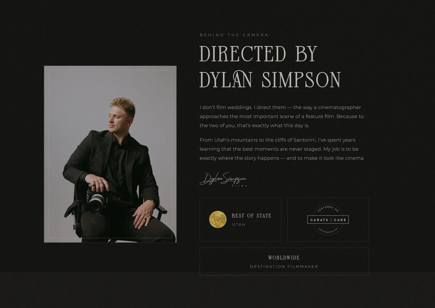
Dylan Simpson is a Best of State–winning wedding filmmaker; his wife Tiana shoots the photography. Together they work everywhere from Santorini to Kona, and their films are graded, scored, and edited like cinema.
Their old WordPress site couldn't carry that. It looked like a website. The brief for the rebuild was simple and demanding at once: every page should feel like their work: dark, cinematic, editorial, with nothing off the shelf. So we designed the whole thing in Figma first, then built it by hand.
Every scroll sets a scene.
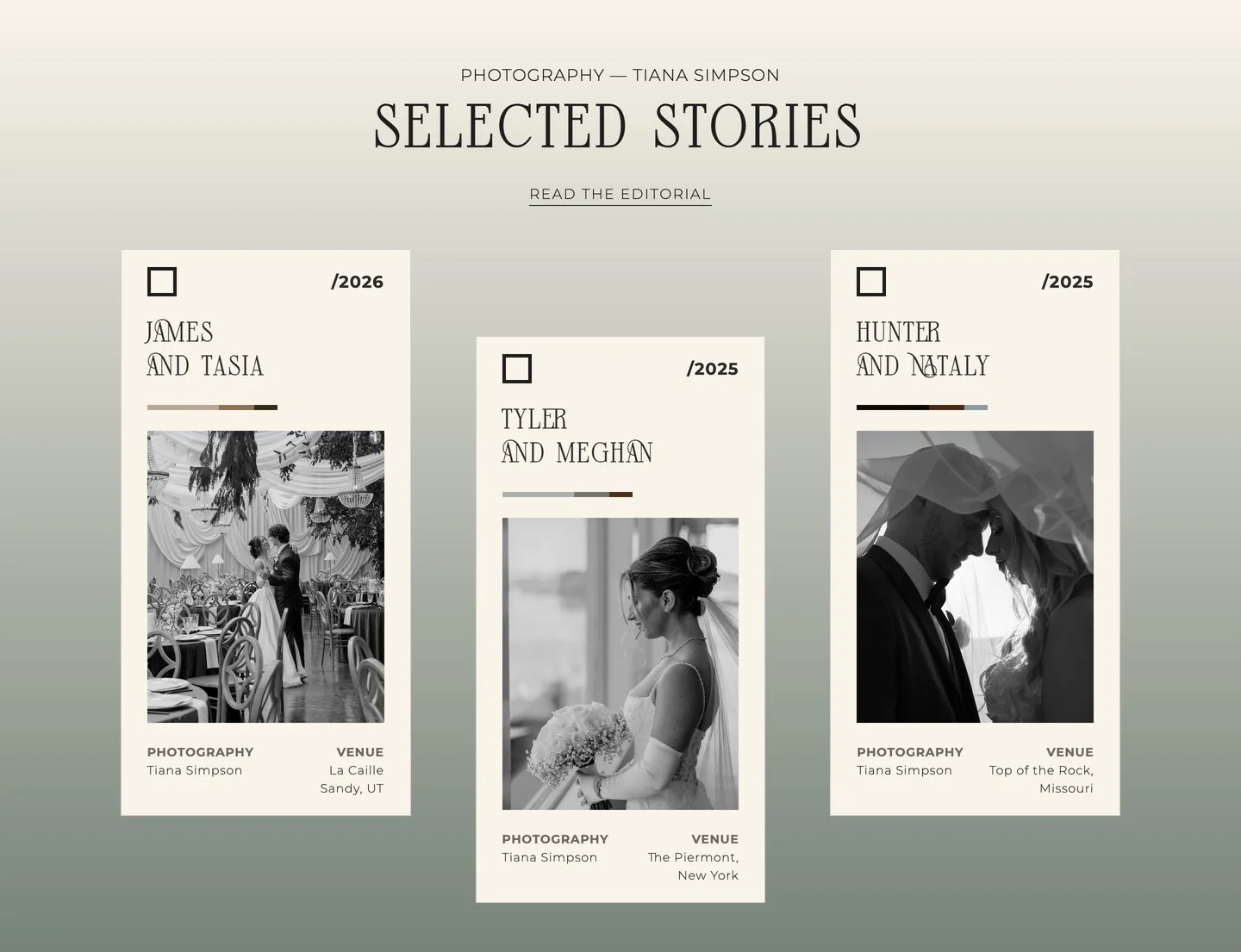
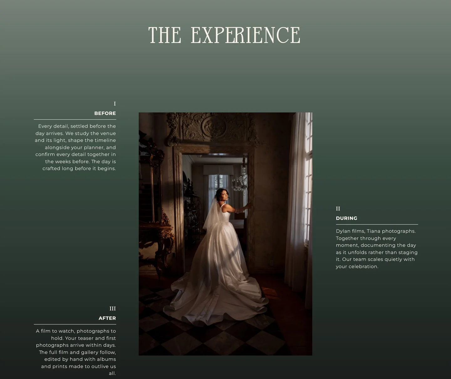
The homepage opens on a full-bleed film. No headline shouting over it, just the work. From there it moves like an opening sequence: a quiet editorial introduction, story cards whose color bars are sampled from each couple's actual gallery, and a three-act "experience" section that walks couples through before, during, and after the wedding day.
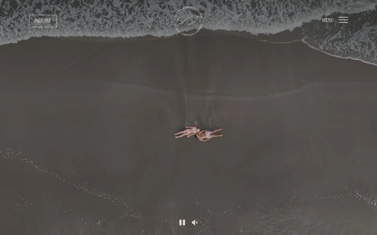
The homepage opens on film. The hero is a real wedding, playing
dylansimpsonfilms.com, live right now, opens in a new tab
A theater, not a gallery.
Most videographers put their films in a grid. We built Dylan a theater. The page opens like a title sequence, and the featured film sits under a "Now Showing" marquee. Press play and the house lights actually go down, a custom dimming sequence before the film takes over the screen. Stage lights at the edges dim as you scroll deeper into the room.
Below it, the collection is a wall of one-sheets: every wedding gets a real movie poster, generated from structured data, so a new film joins the wall in minutes, not a redesign.
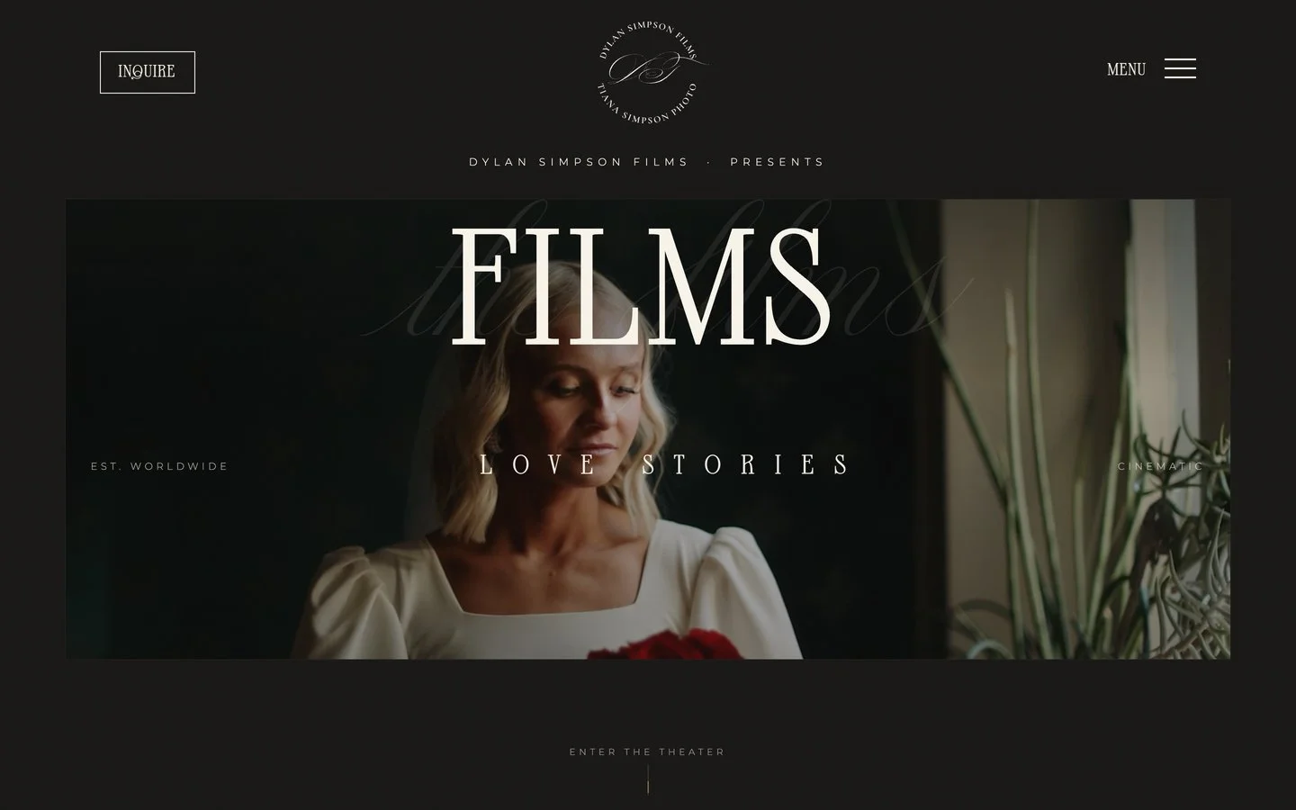
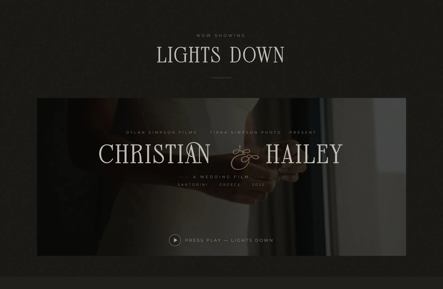
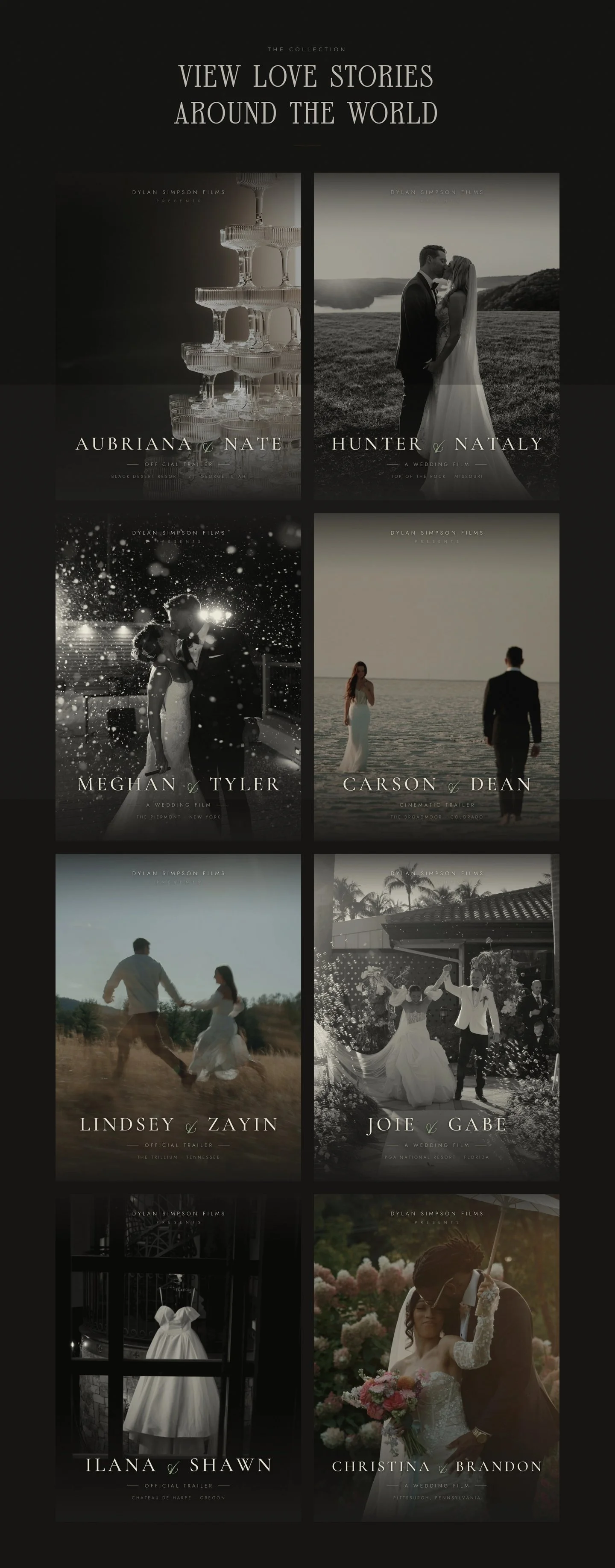
The poster wall: hover to scroll it. Every film gets a one-sheet.
A print magazine, published to a URL.
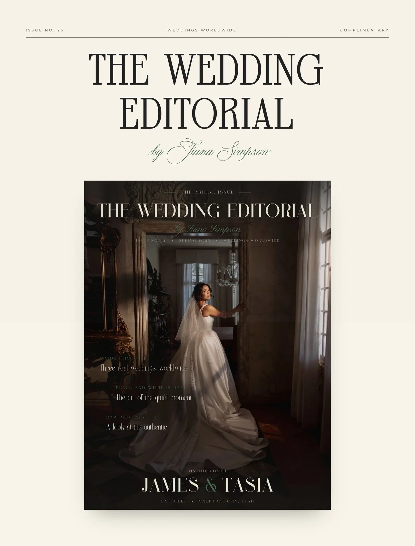
Tiana's photography didn't get a grid either. Her page is built as an issue of a magazine: masthead, table of contents, and three fully art-directed wedding stories, set in editorial serifs with real layouts, not stacked thumbnails.
It ends the way a photographer's process does: a darkroom contact sheet with the selects circled by hand, and a page of polaroid outtakes with handwritten notes.
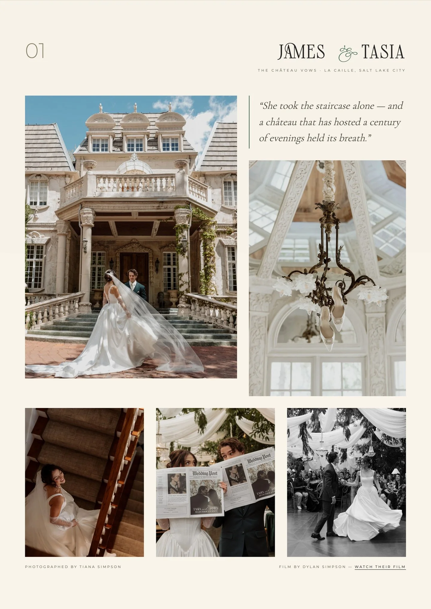
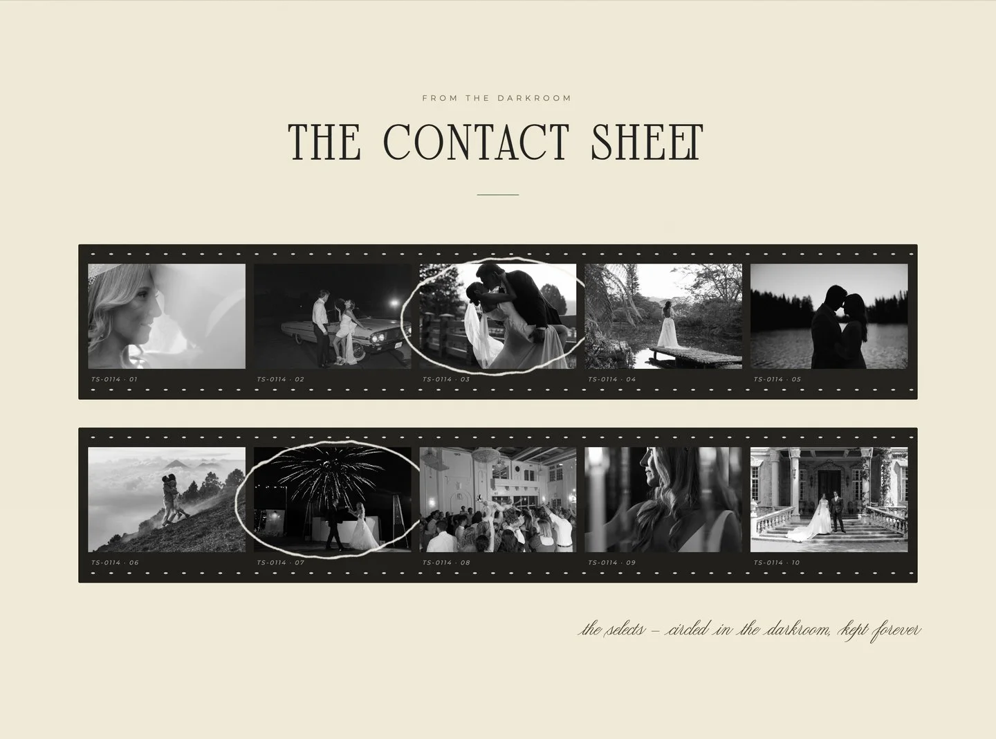
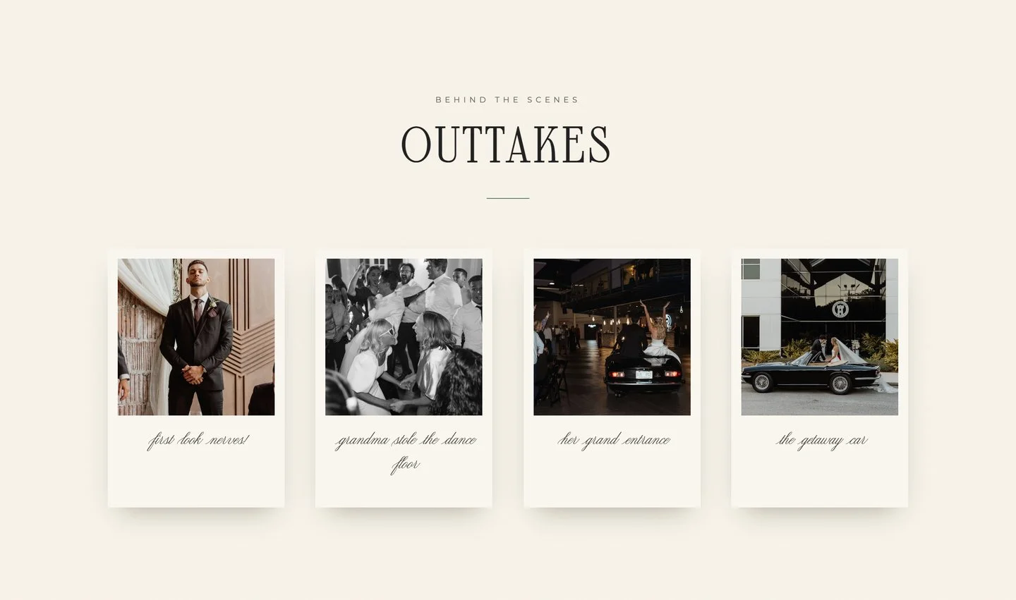
Custom to the pixel, fast by construction.
None of this came off a shelf. The type system, the poster wall, the inquiry flow: each was designed on purpose, built by hand, and wired into the systems we run behind every site we manage.
- Designed page-by-page in Figma first, with typography, spacing, and color pulled straight from the mockups, so what shipped is what was designed
- A bespoke type system: an editorial serif for display, a hairline grotesque for body, script accents used like a signature, not a theme
- Hand-written static pages (no WordPress, no page builder, no plugin stack), so a media-heavy portfolio still loads fast on a phone at a venue
- Film pages generated from structured data, so adding a new wedding to the poster wall is a data entry, not a design project
- The inquiry flow is wired into our studio systems: every lead is logged, relayed, and monitored, and the site itself is watched around the clock
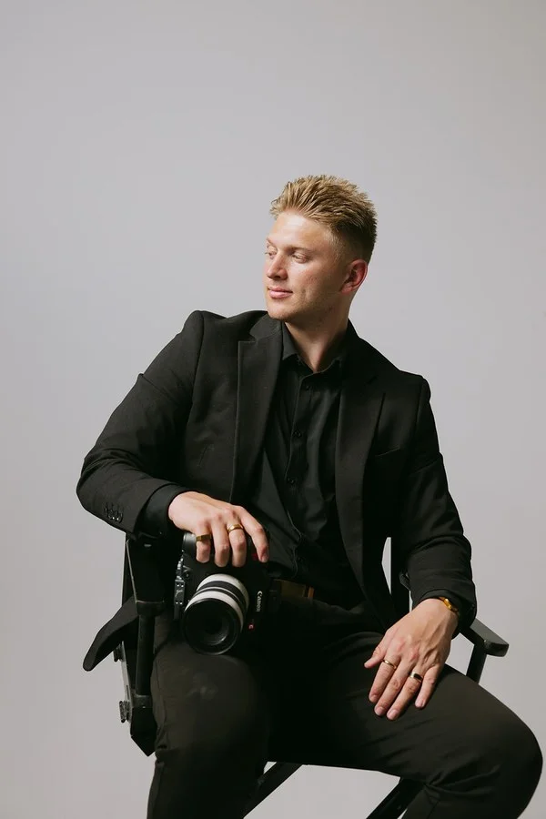
Dylan Simpson
Dylan Simpson Films
The client, four years in:
"Jaxon did amazing for my website. We worked close together with a graphic designer to bring my vision together. Extremely happy with the finished product. He's always available and diligent with little updates to the site as my business continues to grow. I've used Jaxon for my site ever since I started my business and almost 4 years has gone by and he's been with me every step of the way. Great price and a great quality product. Again, could not be happier with the service I've received over these years and will continue to use him as my business is constantly evolving and expanding."
Your work deserves a site this considered.
See more of our work or how a project runs. Every build is designed from zero, like this one.